Table of Contents
A well-styled centerpiece can transform your living room without overwhelming the space. Minimalist designs keep surfaces functional while adding visual appeal. The key is balancing aesthetics with practicality.
Seasonal updates make it easy to refresh your look. Spring brings lighter tones and natural textures. These simple changes create a welcoming atmosphere.
Experts recommend focusing on three elements: scale, contrast, and negative space. This approach ensures your arrangement feels intentional. Uncluttered surfaces also promote relaxation and focus.
Discover seven smart ways to style your space. From curated trays to statement books, each idea serves a purpose. Your room will feel polished yet livable.
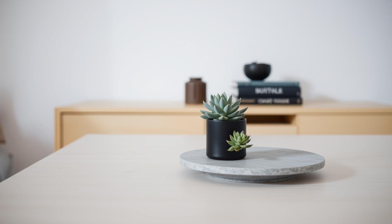
1. Embrace Minimalism with a Single Statement Piece
A single standout object can redefine your space with effortless elegance. This approach lets your living room breathe while drawing the eye to a curated focal point. Brooklinteriors’ viral clear table with a lone vase showcases this power.

Why Less is More
Negative space reduces visual stress, making rooms feel calmer. Studies show clutter-free surfaces boost focus by up to 20%. A sculptural bowl or angular vase delivers artistry without overwhelm.
Choosing the Right Focal Object
Scale is critical. Your piece should occupy ⅓ of the coffee table’s surface max. Caroline Rafferty balances maximalism by pairing one large item with tiny accents.
| Statement Piece | Best For | Avoid If |
|---|---|---|
| Handmade ceramic vase | Organic design | Table |
| Geometric tray | Holding smaller objects | Heavy materials |
| Oversized art book | Height variation | High-traffic homes |
Rotate pieces seasonally—a woven basket in fall, a glass orb in summer. Avoid bulky items that dominate conversations.
2. Use a Tray to Corral Small Decor Items
Trays offer an easy way to organize while keeping surfaces stylish. They turn scattered objects into intentional displays, perfect for busy homes. Designers like Rita Chan use them to create beverage-ready setups on ottomans.
Selecting the Perfect Tray
Material matters. Lacquer trays add polish, while woven rattan (like Tammy Randall Wood’s coastal style) brings texture. Metallics work for modern spaces.
| Material | Best For | Maintenance |
|---|---|---|
| Lacquer | High-gloss looks | Wipe with damp cloth |
| Woven | Organic warmth | Spot clean only |
| Metallic | Modern contrast | Polish monthly |
Size follows the golden ratio: your tray should cover ⅔ of the coffee table’s surface. Nest smaller trays inside for layered dimension.
Styling a Balanced Tray Vignette
Leave 40% negative space to avoid clutter. Pair practical items like coasters with a sculptural book stack. Rita Chan’s ottoman tray includes a carafe for guests.
Rotate seasonal accents—a ceramic bowl in winter, seashells in summer. The goal? A curated look that still feels lived-in.
3. Coffee Table Decor Ideas That Maximize Space
Odd-numbered groupings create instant harmony for eye-catching displays. Studio Thomas James proves this with yellow blooms arranged in a triangular formation—color-coordinated for visual interest. The result? A balanced look that feels organic, not overcrowded.

The Rule of Threes for Visual Harmony
Three is the magic number for dynamic arrangements. Byron Risdon’s game-night setup follows this principle: a stack of books (low), a tray (medium), and a lamp (tall). This formula ensures movement while keeping 40% negative space.
| Height Tier | Example Items | Pro Tip |
|---|---|---|
| Tall | Vase, candleholder | Anchor corners |
| Medium | Tray, small plant | Layer textures |
| Low | Coasters, flat books | Leave walkaround space |
Mixing Heights and Textures
Contrast adds depth. Pair a smooth marble tray with rough-hewn wooden beads, or stack glossy art books under a matte ceramic bowl. Avoid identical height groupings—they flatten the look.
For a spring coffee table, try fresh greens in a slender vase (tall), a woven basket (medium), and a single citrus fruit (low). The combo feels lively yet uncluttered.
4. Incorporate Fresh Flowers or Greenery
Fresh blooms breathe life into any space with effortless charm. Breeze Giannasio’s Maui retreat showcases how a single snake plant can revive a room. Whether real or faux, greenery adds texture and color while purifying the air.

Best Low-Maintenance Plants for Surfaces
Not all greens demand constant care. These thrive in low light:
- Snake plants: Survive weeks without water.
- Air plants: No soil needed—mist weekly.
- Preserved eucalyptus: Lasts months, no watering.
Kimbo’s espresso brick trick works here: place small pots on stacked bricks to add height.
Faux vs. Real: Pros and Cons
Choose based on lifestyle:
| Type | Pros | Cons |
|---|---|---|
| Real | Natural fragrance, air-purifying | Weekly maintenance |
| Faux | No upkeep, allergy-friendly | Dust accumulation |
For spring, pair vase flowers with neutral tones. Avoid strong scents in small rooms—opt for lavender or unscented stems.
5. Style with Stacked Books for Height and Interest
Stacked books offer a dual-purpose solution for storage and visual appeal. Annie Kern’s viral 8-book display proves how literary arrangements can add height while hiding remotes or notebooks underneath. This approach turns your coffee table into a conversation starter with layered personality.

Creative Uses as Functional Risers
Transform hardcovers into display platforms for smaller objects. Abigail’s framed fern prints gain prominence when elevated on a sturdy book stack. For stability:
- Place heavier volumes at the base
- Use art books as stands for ceramic pieces
- Leave negative space between stacks
Designing Cohesive Book Stacks
Remove dust jackets to reveal unified spine colors—neutral tones create a calming effect. Interior designer Annie Kern recommends:
| Color Grouping | Visual Effect | Best Paired With |
|---|---|---|
| Monochromatic | Sophisticated flow | Metallic accents |
| Complementary | Dynamic contrast | Green plants |
| Rainbow | Playful energy | Minimalist ceramics |
Alternate vertical and horizontal stacks to guide the eye across the surface. Keep the tallest stack under 12″ to maintain sightlines in conversation areas. For seasonal refreshes, swap art books to reflect current interests—a travel anthology in summer, architecture tome in fall.
6. Add Warmth with Candles or Lanterns
Glowing accents instantly elevate any living space with cozy sophistication. Designers like Cullman & Kravis use tapered candles to create elegant height variations. Whether flickering flames or flameless LEDs, lighting adds depth to your design.

Battery-Operated vs. Real Flames
Remote-controlled flameless options offer safety for homes with kids or pets. Real wax candles provide authentic ambiance but require wick trimming and monitoring.
| Type | Best For | Maintenance |
|---|---|---|
| Battery-operated | High-traffic areas | Replace batteries yearly |
| Real flames | Formal gatherings | Trim wicks to ¼ inch |
“Stagger candle heights by 2-inch increments for dynamic visual flow.”
Seasonal Scent Suggestions
Fragrances set the mood. For spring, try citrus or fresh linen. Summer calls for ocean breezes or coconut.
- Spring: Grapefruit + rosemary
- Summer: Salted driftwood
- Year-round: Unscented for subtlety
Cluster lanterns in odd numbers for drama. Keep candle diameters under 3 inches for small surfaces.
7. Create a Seasonal Color Scheme
Color transforms spaces instantly, setting the mood before a single word is spoken. Shavonda Gardner’s metallic centerpiece demonstrates how strategic accents elevate any arrangement. The secret? Balancing timeless neutrals with seasonal pops.

Spring Pastels vs. Year-Round Neutrals
Pantone’s 2024 spring trends favor soft peach and butter yellow. Studio Thomas James uses these hues in floral accents against warm beige trays. Follow their 80-20 formula:
- Base layer: 80% neutral tones (taupe, cream, gray)
- Accent layer: 20% seasonal color (mint green for spring)
- Metallic touches: Brass or chrome for continuity
Removable elements make transitions effortless. Swap velvet pillows for linen covers when temperatures rise. Paint commitments work best on larger walls, not surfaces.
Accent Colors That Pop
Repeat small colorful elements for cohesion. Studio Thomas James clusters yellow blooms with matching book spines. This creates rhythm without clutter.
“Metallics act as neutral conduits between seasons—their shine bridges color palettes effortlessly.”
| Season | Accent Color | Pairing Tip |
|---|---|---|
| Spring | Lavender | Combine with brushed nickel |
| Summer | Coral | Offset with woven textures |
| Fall | Terracotta | Layer under glass cloches |
For living room versatility, choose three interchangeable accent colors. Store off-season items in labeled boxes for quick updates.
8. Experiment with Textural Contrasts
Texture creates depth and personality in any space. Mixing materials adds visual interest while keeping surfaces functional. The key is balancing contrasting elements without overwhelming the eye.

Woven Baskets and Metallic Accents
Tammy Randall Wood’s coastal-inspired rattan tray proves natural fibers pair beautifully with sleek metals. Her design combines a woven base with brass candle holders for perfect harmony.
Try these unexpected combinations:
- Jute baskets with mercury glass votives
- Rattan trays with chrome bookends
- Macramé coasters under a steel sculpture
MA Allen’s chess table demonstrates how texture serves function. The rough stone pieces contrast with a smooth walnut board. This creates tactile interest during gameplay.
Smooth Ceramics and Rough Wood
Opposing finishes create dynamic tension. A glossy ceramic bowl on a reclaimed wood slab makes both materials stand out. Follow this formula for balance:
| Base Layer | Middle Layer | Top Layer |
|---|---|---|
| Rough (wood slice) | Textured (linen napkin) | Smooth (porcelain dish) |
| Matte (concrete tray) | Glossy (acrylic box) | Natural (driftwood) |
Limit textural items to three types per surface in small spaces. Too many competing textures feel chaotic rather than curated.
Remember: texture isn’t just visual—it’s tactile. Choose materials that invite touch while withstanding daily use. Your space will feel richer without sacrificing functionality.