Table of Contents
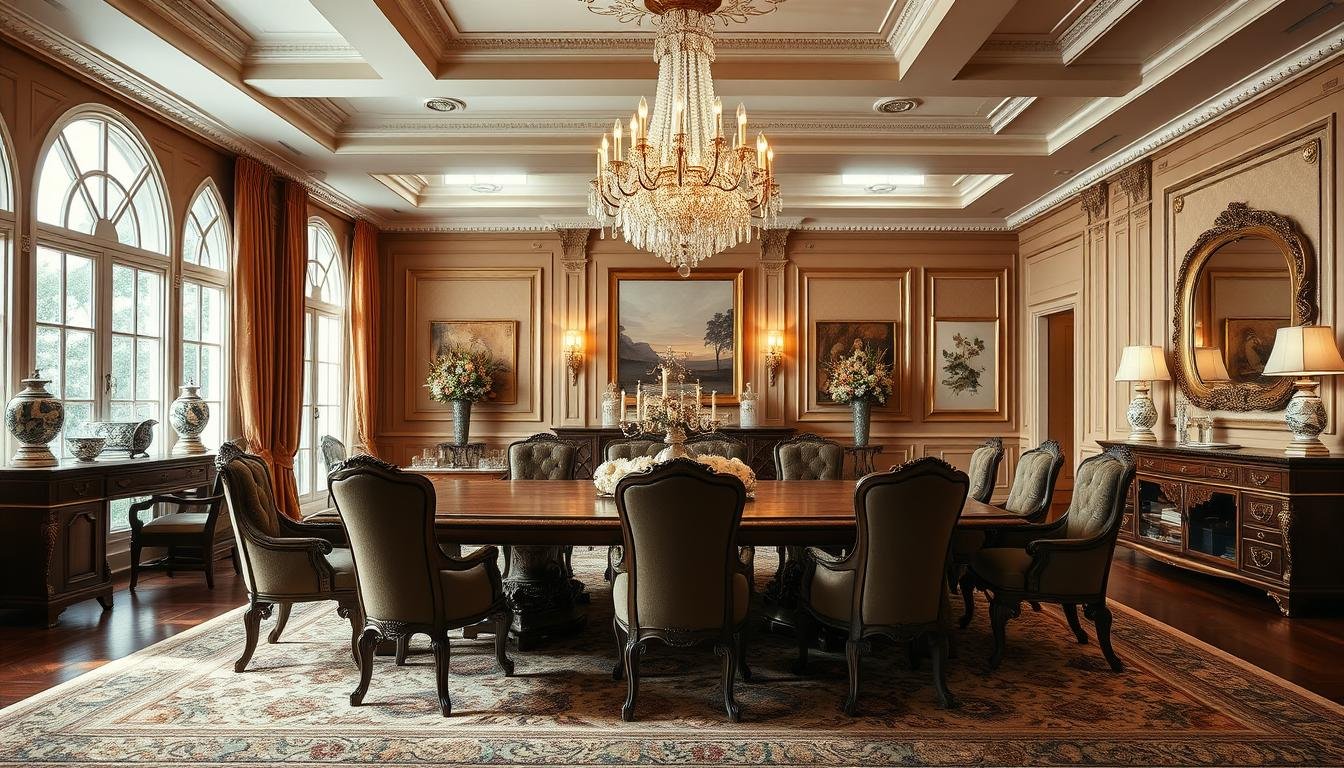
Modern design trends are transforming how we use our space. Whether you love sleek minimalism or bold maximalism, there’s a fresh approach for every taste.
Top designers like Jeremiah Brent and Lauren Nelson share their secrets for balancing form and function. From flexible layouts to outdoor setups, these concepts work in any home.
Small rooms? No problem. Clever solutions like banquettes and dual-purpose tables maximize every inch. Statement lighting adds flair without overcrowding.
Ready to rethink your setup? These eight ideas blend style and practicality effortlessly.
1. Split It Up: Dual Dining Tables for Flexibility
Why settle for one table when two can transform your space? Modular setups adapt to any occasion, from cozy dinners to lively parties. Designers like Jeremiah Brent swear by this hack for its seamless versatility.

Push-Together Tables for Intimate or Large Gatherings
Two matching oak tables anchor Brent’s Vermont home. Hidden alignment hardware keeps them stable when combined, seating up to 12 guests. Separated, they create intimate nooks with 36″ between them—ideal for traffic flow.
“A dining table should grow with your life, not limit it.”
Extendable leaves ensure smooth transitions. Round tables work best for small areas, while rectangles suit open layouts. Below, compare popular options:
| Type | Best For | Capacity |
|---|---|---|
| Round | Small spaces | 4–6 people |
| Rectangle | Open concepts | 8–12 people |
| Square | Corner setups | 4–8 people |
Jeremiah Brent’s Vermont Home Inspiration
His dual-table design maintains aesthetic harmony. The natural wood finish blends with neutral walls, while matching chairs unify the look. For cohesion, repeat materials like metal bases or woven textures.
2. Alfresco Dining: Move Your Meals Outdoors
Transform your mealtime experience by taking it outside with alfresco setups. Fresh air and natural light elevate casual brunches and dinner parties alike. The right furniture ensures your space stays stylish through every season.

Weather-Resistant Dining Sets (Like RH)
Invest in pieces built to last. RH’s sleek dining set features powder-coated aluminum frames that withstand rain, sun, and wind. Pair them with Sunbrella cushion fabrics for fade-resistant comfort.
Compare popular materials:
- Teak: Naturally durable but requires seasonal sealing.
- Aluminum: Lightweight and rust-proof—ideal for coastal climates.
- All-weather wicker: Offers a cozy texture with synthetic resilience.
Lauren Nelson’s Alfresco Design Tips
Designer Lauren Nelson layers textures for a polished look. Start with an outdoor rug to define the area, then add pendant lights for evening ambiance. Her Vermont patio features RH’s weather-resistant table positioned 12 feet from the kitchen for easy serving.
Pro tips:
- Opt for a 28–30″ table height for ergonomic seating.
- Store cushions in built-in bins to protect them from dew.
- Mix metals and woods for visual interest without clutter.
3. Corner Banquettes: Save Space in Small Dining Rooms
Tight on square footage? A corner banquette unlocks hidden potential in compact areas. Designer Meghan Shadrick’s 78-inch L-shaped design fits six people in a 10×12-foot space—proof that smart seating trumps size.

Meghan Shadrick’s Traffic-Flow Solution
Her bench sits 24″ deep with 30″ clearance to the table edge, ensuring easy movement. Performance velvet upholstery adds durability, while the 42″ gap opposite accommodates wheelchairs. “Flow matters more than footprint,” she notes.
Built-In Storage Ideas
Flip-up seats reveal hidden compartments for linens or serveware. Shadrick’s design includes drawers for flatware, doubling utility. For cohesion, match the bench finish to your table legs or lighting fixtures.
- Material tip: Sun-resistant fabrics like polyester blends withstand daily use.
- Layout hack: Angle the banquette 45° to open up narrow rooms.
4. Mix Formal and Casual Elements
Blending elegance with comfort creates a space that feels both polished and inviting. Designer Minette Jackson masters this balance by pairing design extremes—think DeGournay silk panels with vintage stools.

Woven Wallpaper + Luxe Accents
Jackson’s 70/30 rule keeps spaces grounded yet glamorous. She layers Phillip Jeffries grasscloth wallpaper with crystal chandeliers for contrast. “Texture softens grandeur,” she notes.
Try these pairings for harmony:
- Linen + marble: Natural fabric drapes over a sleek table.
- Rattan + crystal: A woven pendant light over glossy stemware.
Organic Materials for Balance
Sisal rugs anchor formal setups while reducing echo. Jackson favors organic materials like unbleached wool for warmth. For lighting, Robert Abbey’s drum pendants bridge styles effortlessly.
Wallpaper care tip: Use a soft brush for grasscloth to avoid fraying. In high-traffic areas, opt for scrubbable vinyl blends.
5. Ground Bold Patterns with Neutral Rugs
Bold patterns make a statement, but they need balance to avoid overwhelming your space. Designer Colleen Simonds layers an 8×10 sisal rug beneath Schumacher’s vibrant wallpaper, proving neutrals anchor even the wildest designs.

Colleen Simonds’ Print-Mixing Formula
Her secret? The 60/30/10 rule:
- 60% dominant: The wallpaper’s large-scale print.
- 30% secondary: Rug texture (like sisal’s weave).
- 10% accent: Metallic finishes or glossy tableware.
“A neutral base lets colors sing without competing.”
Choosing the Right Scale and Color
Keep patterns cohesive with a 3:1 ratio—wallpaper motifs should be three times larger than the rug’s. Benjamin Moore’s White Dove on walls ties everything together.
| Rug Fiber | Best For | Care Tips |
|---|---|---|
| Wool | High-traffic areas | Vacuum weekly; blot spills immediately |
| Jute | Texture lovers | Avoid moisture; rotate to prevent sun damage |
For busy spaces, opt for stain-resistant treatments. Simonds prefers wool for durability but adds jute runners for layered interest.
6. Double the Lighting for Long Tables
Lighting transforms long tables from functional to fabulous. Twin fixtures eliminate dark spots and create a balanced glow. Lark Interiors nails this with twin 24″ Hubbardton Forge chandeliers over a 96″ table.

Pairing Chandeliers Like a Pro
Space them 30″ apart for even coverage on 8-foot tables. Each fixture’s 1500–3000lm output ensures no shadowy corners. Dimmer switches let you adjust from bright brunches to moody dinners.
“Dual chandeliers aren’t just practical—they’re a design statement.”
Why Recessed Lights Fall Short
Overhead cans create uneven pools of light. They lack the focal point of pendant clusters. For code compliance, maintain 30″ clearance above the table.
| Fixture Type | Pros | Cons |
|---|---|---|
| Dual Chandeliers | Even illumination, customizable height | Higher upfront cost |
| Recessed Lights | Minimalist look | Limited adjustability |
Stick to 3000K bulbs for warm, inviting light. Layer with sconces for extra depth.
7. Create a Focal Point with Contrasting Furniture
A striking contrast in furniture can instantly draw the eye and define your space. Designer Alexander Reid masters this with a custom black lacquer china cabinet against crisp white walls. The bold piece features built-in LED lighting, turning it into a functional art display.

Alexander Reid’s Black China Cabinet Trick
His signature paint formula—Benjamin Moore’s Onyx 2133-10—creates a rich, velvety finish. Reid staggers display items at three heights for dynamic visual flow:
- Top shelf: Tall vases or sculptural objects.
- Middle: Medium-height books or stacked plates.
- Bottom: Low-profile bowls or textiles.
How Bold Pieces Elevate Neutral Rooms
In neutral rooms, a single dark cabinet anchors the space without overwhelming it. Reid balances visual weight by:
- Pairing brass hardware with matte black for warmth.
- Angling LED lights at 45° to highlight shelved items.
- Keeping surrounding walls bare to let the cabinet shine.
“Contrast isn’t just color—it’s about texture, scale, and light working together.”
8. Cozy Vibes: Mimic Restaurant Ambiance at Home
Nothing beats the inviting feel of a well-designed, intimate setting. With the right mix of textures and lighting, you can recreate the warmth of your favorite bistro. Start with a moody palette and layer in comfort for a space that’s both stylish and snug.
Of Place Studio’s Moody Paint + Light Wood Combo
For a signature look, Of Place Studio pairs Farrow & Ball’s Railings No. 31—a deep, velvety black-blue—with white oak finishes. The contrast adds depth, while an eggshell sheen on walls and satin trim keep it refined. “Dark hues absorb light, making spaces feel enveloping,” their team notes.
Pro tips for balance:
- Anchor the palette with light wood furniture or flooring.
- Use 18″ sconces at 66″ height to cast a warm glow.
- Add brass hardware for subtle metallic warmth.
Soft Seating and Low Lighting Tips
Plush, soft seating is key. Opt for chair cushions with 1.8–2.5lb foam density—supportive yet forgiving. Dimmable LED strip lighting under sideboards creates a soft uplight effect, while 2700–3000K bulbs mimic candlelight.
For sound-dampening:
- Layer a thick wool rug underfoot.
- Add linen drapes to soften echoes.
- Display textured ceramics or books to break up hard surfaces.
“Ambiance isn’t just visual—it’s how a space feels when you’re in it.”