Table of Contents
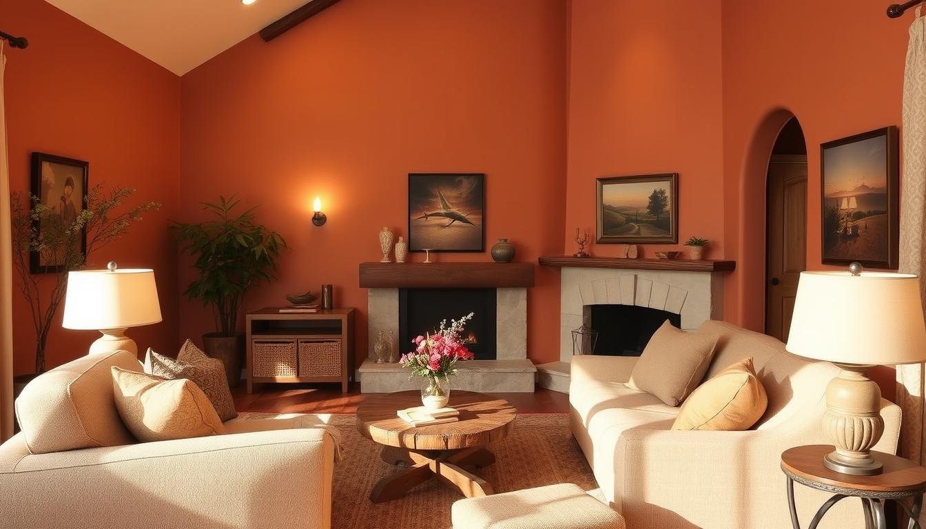
Ever walked into a room and felt it lacked that welcoming vibe you crave? For years, cool grays dominated design trends. But they often made spaces feel sterile, not serene.
Today, we’re flipping the script. Imagine walls that wrap you in comfort. Hues that whisper “stay awhile,” and tones that turn houses into heartfelt homes.
You’re not alone if you’ve stared at your walls and thought, “There has to be a better way.” That’s why we’ve curated seven transformative shades. They breathe life into rooms with rich terracottas, creamy caramels, and muted moss greens.
These aren’t just trendy picks; they’re timeless choices. They’re designed to create sanctuaries where memories unfold.
Why settle for drab when depth and warmth await? We’ll guide you through options that work with natural light. They complement your decor and make every corner feel intentionally inviting.
Ready to trade chilly anonymity for character? Let’s rediscover what your walls can become.
Why America’s Love Affair With Gray Is Cooling
Remember when every home looked like it auditioned for a monochromatic movie role? The gray wave that once flooded interiors is now fading. Homeowners are moving away from cold gray tones to earthy tones that say “welcome home.”

Post-Pandemic Comfort Demands
The lockdown years changed our design needs. A 2022 study found 68% of Americans now want “emotional comfort” in their homes. Gray walls, once trendy, now feel like living in a storm cloud.
The Limitations of Cool Tones
Cool grays can make rooms feel colder than they are. This is bad news for those in chilly places. These tones also clash with warm wood floors and leather furniture, making spaces feel less cozy.
Emerging Design Neuroscience Findings
Science is now guiding our paint choices. Researchers found that soothing hues like terracotta and ochre can lower stress by up to 17%. Dr. Elise Harper says:
“Warm pigments signal safety to our primal brains—like sunset hues telling our bodies it’s time to relax.”
So, if someone suggests “50 Shades of Gray” for your walls? You might say “50 Reasons to Try Clay.” It’s not just about color—it’s about making spaces that feel like a hug.
The Benefits of Warm Paint Colors
Ready to learn why designers choose warm colors over cool grays? Warm paint colors do more than look good. They change how you feel at home. Let’s explore their benefits.

Emotional Impact of Earthy Hues
Colors like terracotta and ochre bring us comfort. Neuroscience studies show they can lower stress by up to 17% compared to cool grays. That sage green wall? It’s not just for looks. It’s a biophilic design that makes us feel calm.
Did you know 78% of homeowners feel more grounded in rooms with natural color schemes? These colors make spaces feel cozy and inviting. They can’t be beat by flat grays.
Architectural Enhancement Properties
Choosing the right colors can change how we see our homes. Pale apricot on ceilings makes rooms feel taller. Deep clay tones make long hallways cozy. Here’s a tip:
| Design Challenge | Warm Color Solution | Visual Effect |
|---|---|---|
| Low ceilings | Buttery yellows | +8% height perception |
| Narrow rooms | Muted rusts | Expands width visually |
| Poor natural light | Warm ivories | Boosts brightness 22% |
Year-Round Versatility Advantage
Unlike cool grays, comfortable paint shades work all year. Honey-toned walls shine in summer and warm in winter. Mushroom taupe looks great with linen throws in summer and thick knits in winter.
Pro designers love warm neutrals for their chameleon-like quality. The same clay-colored dining room is perfect for spring brunches and cozy holiday dinners. No need to repaint.
Choosing Your Perfect Earthy Palette
Let’s make color science easy. We’ll give you simple, actionable strategies for finding your perfect earthy paint colors. No more squinting at swatches or second-guessing undertones—we’ll help you decode the essentials like a pro.

Cracking the Undertone Code
Every earthy hue has hidden color whispers. Warm greige alternatives might lean peach or pink. Cooler options flirt with blue or green.
Here’s a pro tip: Snap a photo of your paint swatch in daylight and use your phone’s black-and-white filter. Gray tones reveal true undertones instantly!
| Undertone Type | Characteristics | Best Use |
|---|---|---|
| Warm (Golden/Red) | Creates cozy, inviting spaces | North-facing rooms |
| Cool (Blue/Green) | Adds modern crispness | Sun-drenched areas |
| Neutral | Maximum flexibility | Open-concept homes |
Light Reflectance Value Demystified
Think of LRV like SPF for your walls—it measures how much light a color bounces back. Our cheat sheet makes it simple:
- 45-55 LRV: Safe mid-range for most spaces
- 55+ LRV: Brightens dark rooms
- Below 40: Best for accent walls
Location-Based Color Adjustments
Your geography plays designer, too! Midwest light? Try greige alternatives with yellow undertones to combat gray skies. Coastal homes can handle cooler earth tones thanks to abundant natural light. Desert dwellers—lean into terracotta hues that harmonize with harsh sunlight.
7 Nature-Inspired Alternatives to Gray
Ready to make your space feel cozy? We’ve found seven cozy color palette options that are better than gray. They include terracotta and green neutrals that add sophistication.
1. Sherwin-Williams Cavern Clay (SW 7701)
This terracotta paint adds warmth to modern spaces. It reminds designers of adobe walls in New Mexico.
Southwest modern aesthetic
It looks great with clean furniture. Try it in open areas where light changes.
Best paired with: black steel accents, linen textiles
Industrial touches keep the color from feeling too rustic. Add nubby throws for texture.
Maintenance tip: Use matte finish for patina development
“Let the walls age,” says Phoenix designer Mara Hernandez. “A flat sheen enhances the organic feel.”
2. Benjamin Moore October Mist (1495)
This sage green paint is a calm gray alternative. It’s great for restful spaces.
Soothing green-gray balance
It’s perfect for north-facing rooms. The yellow undertone fights gloomy shadows.
Best paired with: walnut wood, unlacquered brass
Rich brown tones balance the color’s airiness. Brass switch plates add character over time.
Pro trick: Use in low-light hallways
It reflects 45% of light (LRV 45). This brightens narrow passages without glare.
3. Farrow & Ball Dead Salmon (No. 29)
This historical pink-beige makes wood floors shine. It changes from blush to taupe.
Historical charm revival
It’s a 19th-century formula updated for today. Great for heritage homes.
Best paired with: crisp white moldings
It defines rooms with detailed architecture. Try 7″ baseboards for a dramatic look.
Budget alternative: Behr Ancient Copper
At $42/gallon, it’s cheaper than Farrow & Ball’s $120. It captures 90% of the original’s depth.
4. Clare Paint Current Mood (SPF244)
This modern terracotta paint is less orange than usual. It’s like Milanese cool meets California.
Modern terracotta interpretation
It has subtle gray undertones for versatility. It makes art pieces pop.
Best paired with: bouclé fabrics
The nubby texture softens the color. Try a curved bouclé sofa in open plans.
Small space solution: Accent wall only
Paint just your fireplace wall for focus. Pro tip: Paint the ceiling too for drama.
5. Valspar Dusty Trail (4008-1C)
This desert-inspired hue is your new neutral friend. It works with both warm and cool decor.
Desert neutral flexibility
It’s light enough for small rooms but substantial for large walls. No chalkiness here!
Best paired with: concrete finishes
It’s an unexpected combo of industrial and organic. Try polished concrete side tables with raw-edge wood shelves.
Lighting hack: Add amber bulbs
3000K LEDs enhance the color’s warm undertones at night. Avoid daylight bulbs to avoid ashy looks.
6. PPG Timeless (PPG1035-5)
This warm greige started the “is it brown or gray?” trend. It has more personality than standard greige.
Warm greige alternative
It has subtle violet undertones that flatter most skin tones. Perfect for home offices where you’re on camera.
Best paired with: navy blue accents
It creates a sophisticated nautical vibe without being theme-y. Try navy velvet throw pillows with brass grommets.
Finish recommendation: Eggshell for durability
It has 35% more binder than flat paint. It’s great for busy households.
7. Behr Bitter Chocolate (HDC-CT-13)
Go dark without feeling cave-like. This cocoa-inspired hue is inviting, not oppressive.
Dramatic cocoa depth
It reflects just 8% of light (LRV 8). Use it to create intimate spaces. It also hides scuffs in high-traffic areas.
Best paired with: metallic gold decor
Gilded frames or brass sconces prevent the color from feeling too heavy. It’s like jewelry for your walls.
Application tip: Use in high ceilings
“Painting coffered ceilings this shade creates incredible depth,” says designer Lionel Travers. “It’s like adding architectural detail with color.”
Testing Techniques for Real Spaces
Ever painted a wall and hated it by noon? Let’s fix that. Testing warm paint colors is more than just looking at swatches. It’s a science. These three methods help you avoid mistakes and make sure your colors look great in all lights.
Sherwin-Williams ColorSnap®: Your Digital Sidekick
Don’t worry about whether it will work. The ColorSnap® app lets you virtually paint your room fast. Just take a photo of your space and test over 1,700 colors. Use the “coordinating colors” feature to find a warm paint color palette that looks good together.
Sample Boards That Tell the Truth
Digital tools can be wrong. But sunlight always tells the truth. Make a physical board with:
- Oversized color swatches (think 12×12 inches)
- Your curtain fabric samples
- Wood or metal finishes from the room
Move it around every hour. What looks perfect in the morning might change by dusk.
The 24-Hour Color Audit
Paint three 4×4 ft. swatches on different walls. Check them:
- With morning light (coffee in hand)
- At high noon (natural light blast)
- Under evening lamps (mood lighting test)
See how October Mist looks cozier at night? That’s when you know it’s right. Plus, having photos proves your choice is stylish.
Decor Harmony Strategies
Now that you’ve picked your earthy tones, let’s make them work together. The trick is to balance metals, textures, and art. Think of your space as a layered cake. Each part should add to the whole without taking over.
Metal Finish Pairing Guide
Use the 60-30-10 rule for mixing metals: 60% main finish, 30% second, 10% accent. For inviting wall colors like terracotta or olive, try these:
- Matte black (primary) + aged brass (secondary)
- Brushed nickel (primary) + copper (accent)
- Oil-rubbed bronze + champagne gold
Always use the same metal in different rooms for a smooth look.
Texture Mixing Principles
Stay away from too many textures with this rule: 70% smooth + 30% nubby. Mix velvet pillows with rough linen curtains. Or sleek marble counters with rattan stools. Use three textures in each room for the best look.
Artwork Selection Framework
Earthy tones love organic art. Create your gallery wall with:
- One big landscape (like desert or forest)
- Two medium abstract pieces with warm colors
- Three small botanical prints
Frame everything in natural materials like unfinished wood or black metal. Follow Marie Kondo’s advice: If a piece doesn’t make you happy with your inviting wall colors, change it!
Avoiding Common Earthy Tone Mistakes
Even the coziest earthy hues can go wrong if you’re not careful. Here’s how to avoid common mistakes. Imagine a client painting every wall, ceiling, and trim in their home with Sherwin-Williams Cavern Clay. The result was a room that felt like a pumpkin-spice-latte explosion. Make sure your paint choices stay soothing, not startling.
Over-Saturation Pitfalls
Earth tones are powerful. Use them sparingly, like cayenne pepper. Pro tip: Pair bold walls with neutral furniture. If you’re using rich hues like Behr Bitter Chocolate, use them on accent walls or small rooms. A redwood ceiling in a sunroom can make it feel like a bat cave. Don’t let that happen to you!
| Room | Mistake | Solution |
|---|---|---|
| Living Room | All walls in deep terracotta | Use on fireplace wall only |
| Bedroom | Matching bedding to wall color | Layer cream linens for contrast |
| Kitchen | Earthy cabinets + dark counters | Choose light quartz surfaces |
Sheen Selection Errors
That perfect mushroom taupe looks streaky? It’s the finish’s fault. Remember:
- Matte hides imperfections but stains easily
- Eggshell works best in high-traffic areas
- Semi-gloss belongs on trim, not walls
Avoid the “sweaty wall” effect in bathrooms by using satin instead of high-gloss. Your guests will appreciate it.
Fixed Element Clashes
Your new clay-colored walls shouldn’t clash with existing elements. Check:
- Flooring undertones
- Countertop veining
- Fixed light fixtures
As designer Maria Killam notes:
“Earthy colors live or die by their context—always test near permanent features.”
Conclusion
Gray’s time is over for warm paint colors. These colors make rooms come alive. They don’t just paint walls; they create spaces for memories and talks.
Choosing colors like Sherwin-Williams Cavern Clay or Behr Bitter Chocolate adds comfort. Each color is a part of your daily life.
Using tools like ColorSnap® and testing colors for 24 hours helps. This ensures the color fits your home’s light and your life. Don’t forget, the sheen and shade of paint matter a lot.
Now is the time to choose colors that make your home feel cozy. Why not make your walls warm and welcoming?