Table of Contents
Picking the right shade for your home isn’t as simple as it seems. Even the most neutral tones, like white paint, come with hidden complexities. Undertones, lighting, and room purpose all play a role in how the final result looks.
Designers like Donald Kaufman and Lane Ball treat white as a true color, not just a blank canvas. The 2023 trend of using it for entire spaces, including trim, makes selection even more critical.
Always test samples in different lighting. The finish—satin or eggshell—can change how the shade appears. For a failproof option, Sherwin-Williams Pure White remains a top choice among professionals.
Why Choosing the Right White Paint Matters
Not all whites are created equal—light and size play huge roles. A bright shade can make a small room feel airy, while softer tones add warmth to large spaces. Designer Fiona McGettrick notes,
“North-facing rooms need warm whites to counter gray light, while south-facing spaces glow with cool undertones.”
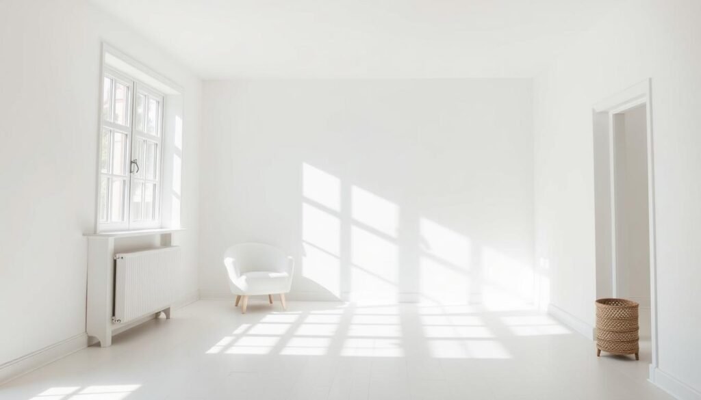
Artificial light changes everything. Zibra’s Lane Ball recommends satin finishes to balance LED glare. Over 68% of designers use the same white for trim, even in colorful rooms—it’s a timeless choice.
Beware of extremes. Tracy McLaughlin warns against “hospital-like grays” or yolky yellows. A ufurnish.com study found 42% repaint due to undertone clashes. Always test at a store before committing.
Things like furniture and flooring shift perceptions. A creamy white might look dingy next to oak floors but crisp with marble. The right shade ties the whole space together.
Understanding White Paint Undertones
The secret to nailing the perfect neutral lies in mastering undertones. These subtle hues hide beneath the surface, turning bland walls into dynamic backdrops. Get it wrong, and your space might feel off-balance.

Warm vs. Cool Whites
Warm whites contain hints of red or yellow, creating cozy vibes. Think creamy buttermilk or soft vanilla. Cool whites lean blue or green, offering crisp, airy feels—like fresh linen.
| Type | Undertone | Best For |
|---|---|---|
| Warm Whites | Red/Yellow | North-facing rooms, traditional spaces |
| Cool Whites | Blue/Green | South-facing rooms, modern designs |
Maugham White No. 2’s blue-grey undertone, for example, counters golden sunlight. Meanwhile, Benjamin Moore’s Simply White brightens entryways without feeling stark.
How Undertones Affect Your Space
Oak floors? They amplify yellow undertones in nearby walls. Designer Tessa Kirby’s reflection rule matters too: “Homes near water or forests absorb blue-green tones from the exterior.”
Test samples near fixed elements like flooring. A shade that looks clean with marble might clash with walnut. Undertones are chameleons—always observe in natural light.
How Lighting Influences Your White Paint Choice
Lighting transforms white walls more than any other factor. The same shade can look warm at dawn and clinical under midday sun. In your house, both natural light and bulbs play starring roles.
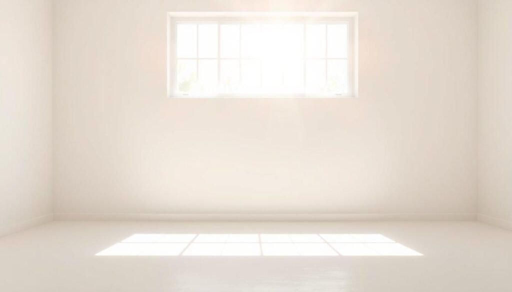
North-Facing vs. South-Facing Rooms
North-facing spaces get cooler, grayish light. Designer Fiona McGettrick swears by Benjamin Moore’s Chantilly Lace here—its subtle warmth fights the gloom. South-facing rooms? They’re flooded with golden rays. Sherwin-Williams Snowbound, with its gray-blue undertone, keeps them balanced.
Artificial Light Considerations
Bulbs change everything. A 2700K warm bulb makes creamy whites richer, while 4000K LEDs highlight cool undertones. Fluorescent office lighting? Avoid Sherwin-Williams Alabaster—it turns sickly yellow.
| Bulb Type | Effect on White Paint | Best For |
|---|---|---|
| 2700K (Warm) | Enhances cream/red undertones | Living rooms, bedrooms |
| 4000K (Cool) | Accentuates blue/green undertones | Kitchens, bathrooms |
Pro tip: Test samples at 9 AM, noon, and 7 PM. The amount of light shifts throughout the day, revealing hidden undertones. What looks crisp in morning light might feel sterile by night.
How to Choose White Paint for Different Rooms
Every room in your home demands a tailored approach. Hallways, kitchens, and bathrooms each have unique lighting and wear patterns. The right shade white enhances functionality while keeping the space cohesive.
Best Options for Dim Corners
Low-light areas need bright, reflective tones. Sherwin-Williams Pure White (7005) with a satin finish combats shadows in windowless bathrooms. For apartments, Dunn-Edwards Milk Glass adds subtle warmth without yellowing.
Durable Picks for Busy Zones
High-traffic walls require tough finishes. Semi-gloss stands up to kitchen splatters and fingerprints. Behr Polar Bear 75 is a top choice for hallways—it hides scuffs while feeling airy.
| Room | Paint Recommendation | Finish |
|---|---|---|
| Bathrooms | Sherwin-Williams Pure White | Satin |
| Playrooms | Benjamin Moore White Dove | Eggshell |
| Mudrooms | Avoid flat finishes | Semi-gloss |
Contrast trims with Sherwin-Williams High Reflective White for sharp definition. Mudrooms take a lot of abuse—skip flat finishes that stain easily. A neutral white balances durability and style.
Testing White Paints Like a Pro
Smart testing methods prevent costly repainting disasters. A tiny swatch won’t reveal how undertones shift in your space. Designers like Zibra’s team use foam boards for side-by-side comparisons—it’s a game-changer.

Why Sample Boards Beat Swatches
Cut 12″x12″ foam boards to test multiple shades at once. Sherwin-Williams’ swatches are 50% larger than competitors’, but boards show true scale. Pro tip: Label each with painter’s tape to avoid mix-ups.
- Corner testing: Place samples near windows and dark walls. Farrow & Ball’s All White famously turns pink in sunset light.
- 24-hour rule: Observe paints at 9 AM, noon, and 7 PM. Lighting changes everything.
Observing Paint at Different Times of Day
North-facing rooms? Check samples during gray afternoon light. Designer Lane Ball warns:
“A shade that works at noon might feel icy by night.”
Avoid testing directly on colored walls—primer first. Over years, pros learned this the hard way. Visit a store for accurate samples; online colors often lie.
Common Mistakes to Avoid When Choosing White
Many homeowners underestimate the impact of surrounding elements on white paint. Over 33% regret ignoring wood tones, while exterior reflections silently shift undertones. Avoiding these pitfalls ensures a cohesive look.
Overlooking Furniture and Flooring
Mahogany furniture amplifies pink undertones, creating a jarring contrast. Similarly, oak floors intensify yellow hues in nearby walls. Designer Tessa Kirby notes:
“Fixed elements like flooring dictate whether a white feels warm or clinical.”
Quick fixes:
- Test samples near large furniture pieces.
- Use gray-balanced whites (e.g., Benjamin Moore Chantilly Lace) with rich woods.
Ignoring Exterior Reflections
Concrete or water nearby? These exterior surfaces bounce blue-green light indoors. A case study showed Greenwich Time No.8 appearing teal near pools. Always observe samples at different times.
Sheen inconsistencies are another trap. Flat finishes on trim collect dust, while semi-gloss resists stains. Here’s a quick guide:
| Surface | Recommended Sheen |
|---|---|
| Trim | Semi-gloss |
| Ceilings | Flat (never use ceiling white on cabinets) |
Thin paint layers risk bleed-through. Always prime dark walls before testing. These choices make or break your space.
Most Popular White Paint Colors Designers Love
Designers consistently rely on a handful of trusted whites that work across diverse spaces. Sherwin-Williams Pure White and Benjamin Moore Simply White lead the pack, appearing in 22% of professional spec sheets according to 2023 industry reports.
Sherwin-Williams Pure White (SW 7005)
With an LRV of 84, this pure white reflects light beautifully in open-concept homes. Its neutral undertones prevent clashes with wood floors or colorful furniture.
Celebrity designer Shea McGee uses it on shaker cabinets, while Joanna Gaines pairs it with black windows for contrast. The satin finish version withstands kitchen grease better than flat alternatives.
Benjamin Moore Simply White
Named 2023 Color of the Year, this warm-leaning shade complements Carrara marble and brass fixtures. Unlike cooler Decorator’s White, it adds subtle warmth to north-facing rooms.
Five celebrity homes showcase its versatility:
- Ellen DeGeneres’ kitchen island
- Nate Berkus’ entryway paneling
- Bobby Berk’s built-in bookshelves
| Name | Best For | Undertone |
|---|---|---|
| Pure White | Doors, ceilings | Neutral |
| Simply White | Interior walls | Warm |
Designer Mark D. Sikes notes:
“These shades form the backbone of my palette—they never compete with art or furnishings.”
Test both in your space before deciding.
When to Use the Same White on Walls, Trim, and Ceiling
Monochromatic schemes create seamless elegance when executed properly. Designer Tracy McLaughlin champions this approach for modern spaces, using one shade throughout to amplify light flow. The effect makes rooms feel taller and more cohesive.
A neutral white like Benjamin Moore Cloud White works beautifully in farmhouse interiors. The key lies in varying sheens—matte walls paired with semi-gloss trim create subtle definition. This trick adds depth without introducing new colors.
For ceilings in humid areas, avoid flat finishes that trap moisture. A satin finish repels condensation better while maintaining uniformity. The gloss difference between surfaces should be noticeable but not stark—about 30% more reflectivity on trim.
Transitional spaces benefit most from unified colors. Sherwin-Williams Extra White 7006 works well on walls, doors, and crown molding. Pro tip: Use a 2″ angled sash brush for razor-sharp edges between surfaces.
The best way to test? Paint large foam boards with different sheens. Observe how light plays across each finish at various times. Remember—your ceiling should be the most matte surface to minimize glare.