Table of Contents
I’ll never forget the first time I rearranged my bookshelves with intention. What was once a cluttered mess became a curated showcase of my favorite reads and treasures. That moment sparked my love for turning shelves into storytelling spaces.
Over the years, I’ve styled dozens for clients and my own home. Each one proves that thoughtful arrangements can elevate an entire room’s vibe. It’s not just about storage—it’s about weaving personality into your interior.
In this guide, we’ll dive into transforming your shelves from functional to fabulous. From decluttering basics to pro-level styling tricks, you’ll learn to balance design and practicality effortlessly.
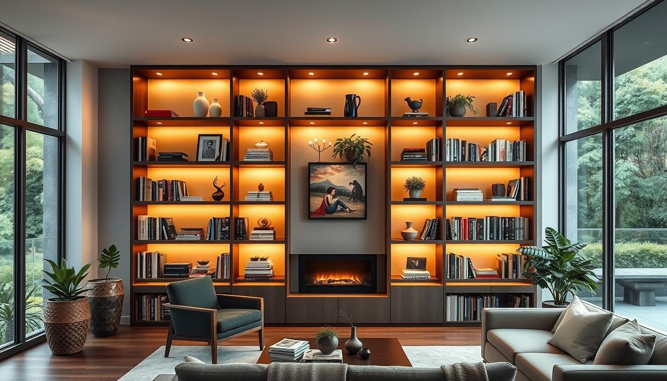
Start with a Clean Slate
Empty shelves might seem boring, but they’re actually a designer’s best friend. Removing everything lets you see the full potential of your space. As Sarah Stacey puts it:
We specifically designed shelf sizing to accommodate certain pieces.
Clear and Clean Thoroughly
I once rushed to rearrange decor without dusting—big mistake. A week later, my favorite vase left a visible ring on the shelf. Now, I swear by this process:
- Use microfiber cloths to wipe down every surface.
- Apply wood polish if your shelves are untreated.
- Measure heights between shelves for tall vases or stacked books.
Organize Before You Style
Labeling items with sticky notes saves time later. Group similar objects (books, frames, ceramics) as you remove them. This way, you’ll spot gaps in your design before committing to a layout.
Pro tip: Snap a photo of your empty shelves. It helps visualize spacing when you’re ready to decorate.
Commit to a Color Palette
Color transforms shelves from storage to storytelling spaces. A thoughtful palette ties your room together, making even mismatched items feel intentional. As designer Sarah Winchester advises:
Stay within a color family—keep pieces meaningful.

Choosing Colors That Complement Your Space
Melanie Turner’s use of Farrow & Ball’s Calke Green shows monochromatic harmony. Try the 60-30-10 rule: 60% shelf background, 30% books, 10% accents. My navy cookbooks became a focal point after removing glossy jackets.
Matching Books to Your Scheme
For instant cohesion, wrap mismatched spines in kraft paper. I did this for a client’s house—the result was sleek and unified. Avoid the rainbow effect unless it’s deliberate. Cluttered hues compete for attention.
Organize by Niche or Theme
Themes turn ordinary shelves into personal galleries. Alex Hitz’s English-style portrait room proves this—Peter Rogers’ artwork blends seamlessly with leather-bound classics. It’s not just storage; it’s a curated experience.

Grouping Books by Genre or Subject
I separate fiction and non-fiction first. Travel books get paired with globes or vintage maps. Cookbooks shine beside copper measuring cups. This method creates space for both function and flair.
Balancing Books with Art
Floating frames 2″ above stacked books adds depth. For a client’s home library, we hung small paintings between shelves. The result? A mini gallery that feels intentional, not cramped.
| Theme | Decor Pairing | Style Bookcase Tip |
|---|---|---|
| Cooking | Utensils, recipe stands | Use open shelves for easy access |
| Nature | Potted succulents, driftwood | Leave negative space for airiness |
| Music | Vinyl records, vintage speakers | Layer horizontal and vertical stacks |
Avoid over-theming—shelves shouldn’t feel like museum dioramas. One client wanted every shelf nautical-themed. We scaled back to anchor bookends and a single ship model. Less was more.
Mix Vertical and Horizontal Stacking
The secret to eye-catching arrangements lies in mixing stacking methods. Alternate vertically and horizontally to break monotony. This technique adds rhythm, making even small shelves feel curated.

Create Visual Flow
Lisa Schwert’s design mantra sticks with me:
Leave about one-third of space open.
I applied this to a client’s clutteredhomelibrary. By laying art books horizontally and paperbacks vertically, thespacebreathed again.
Heavy tomes work best flat. Their weight stabilizes stacks. Paperbacks stand tall to maximize height. Try my “book sandwich”: place a framed photo between bookends, leaning gently against the back.
Balance Decor and Function
Over-stacking warps shelves—I learned this after a $200 repair bill. Now, I use coffee table books as bases for delicate items. Their sturdy spines support ceramics without crowding.
- Layer small objects atop horizontal stacks.
- Keep 30% of each shelf empty for airiness.
- Rotate stacks seasonally to prevent indentations.
Pro tip: Snap a photo from afar. If the arrangement feels chaotic, redistribute items until the eye flows naturally.
Incorporate Different Textures
Tactile contrast brings shelves to life—I discovered this while revamping a client’s bland study. When we added mercury glass vases beside rough-hewn wood bookends, the entire design gained dimension. Texture isn’t just visual; it invites touch and creates rhythm.

Add glass for luminosity between matte pieces, but embrace quiet space too.
Material Pairings That Work
Try these combinations:
- Glossy ceramic bowls on woven rattan trays (Phoebe Howard’s coastal look)
- Brass bookends flanking linen-wrapped journals
- Frosted apothecary jars beside reclaimed wood boxes
For budget-friendly metallics, spray-paint thrift store frames or candle holders. I unified a client’s mismatched home office this way—$15 transformed six items into a cohesive copper collection.
Layering with Intention
Stack a smooth porcelain vase atop a chunky sisal basket. The contrast highlights both pieces. Just avoid overdoing it—three textures per shelf zone max. More creates visual noise.
Last tip: Run your hand across arranged items. If everything feels similarly smooth or rough, swap one element. Texture should surprise and delight.
Layer Books with Decorative Objects
The magic happens when books and decor unite in perfect harmony. Strategic layering turns shelves into dynamic displays that catch the eye. It’s about creating depth while keeping functionality intact.

Stacking Books as Pedestals
Turn hardcovers into display stands for petite items. I use art books as bases for ceramic sculptures—their sturdy spines provide stability. Just remember: no fragile heirlooms on flimsy paperbacks!
For elevation tricks, try this combo:
- Horizontal book stack (3-4 thick volumes)
- Small trailing plant cascading over edges
- Personal artifact like a vintage camera atop
The Power of Three
Odd-numbered groupings create natural balance that even numbers can’t match.
My go-to trio formula: one tall element (vase), one medium (stacked books), one small (brass trinket). Vary heights within each group for rhythm.
For beach-themed shelves, I’ll arrange:
- Turquoise book spines
- Driftwood slice leaning vertically
- Glass jar filled with collected shells
Always leave breathing room between items. Overcrowding kills the curated look you’re after.
Use Greenery to Soften the Look
Nothing breathes life into shelves quite like a touch of green. Plants add movement and freshness that hardcover books alone can’t achieve. Shavonda Gardner’s Caviar-walled home proves this—her trailing vines make built-ins feel like living art.
Choosing Between Trailing and Sturdy Varieties
Pothos saved my shelves after a succulent massacre. Their heart-shaped leaves cascade beautifully, needing water only weekly. Succulents demand bright light—tough for dim shelf space.
For instant drama, install clear Command hooks to guide vines. I train mine to frame book collections. Just avoid moisture-loving species near precious pieces.
The Real Versus Faux Debate
Designer Albert Hadden’s advice changed my approach:
Mix real things at eye level with faux up high where care is tricky.
My go-to combo: real air plants (Tillandsia) beside realistic faux eucalyptus. Always use saucers—water rings ruined my favorite first edition.
| Plant Type | Care Level | Shelf Placement Tip |
|---|---|---|
| Pothos | Easy | Let trails frame shelf edges |
| Snake Plant | Negligent | Anchor bottom shelves |
| Faux Fern | None | Cluster in dead corners |
For functional style, try air-purifying varieties like spider plants. They filter toxins while adding softness between rigid book spines. Just rotate them monthly—even easy-care plants need equal light.
Display Personal Memorabilia
A Moroccan tea glass on my shelf sparks more joy than any designer decor piece. Personal treasures transform shelves into conversation starters. The key? Curating with heart while avoiding clutter.

Travel Souvenirs with Purpose
I use a simple formula: one souvenir + two related books + a neutral base. A client’s seashell collection gained meaning when paired with oceanography titles. Target storage boxes blend seamlessly with wedding photos when color-coordinated.
For delicate items, try this artful arrangement:
- Stack vintage suitcases as risers
- Display small trinkets in clear acrylic boxes
- Layer postcards behind framed family photos
Heirlooms That Tell Stories
Grandma’s vase became a centerpiece when I filled it with dried lavender. Flanked by black-and-white portraits, it turned a shelf into a tribute. Designer Hadley Keller advises:
Mix precious pieces with everyday objects—the contrast adds warmth.
Protect heirlooms with museum putty. I learned this after a crystal paperweight shattered. Rotate seasonal displays to prevent overcrowding—summer seashells swap for autumn leaves in September.
Always keep photos out of direct sunlight. UV rays fade memories faster than you’d think. For framed art, use acid-free mats to preserve colors.
Play with Heights and Sizes
Visual balance transforms shelves from static storage to dynamic displays. It’s about making each item feel purposeful while guiding the eye naturally. Lucy Searle’s advice rings true:
Big books low, small up top.

Anchor with Weighty Bases
Large books belong at the bottom—they ground the arrangement. I learned this after a client’s top-heavy shelf nearly toppled. Now, I follow this formula:
- Tallest object = 2/3 shelf height
- Stack art books horizontally as pedestals
- Use wood blocks under petite frames for elevation
Create Rhythmic Variation
Ascending heights on the left, descending on the right, creates harmony. For a coastal-themed space, I arranged:
- Driftwood (tall, left shelf)
- Stacked paperbacks (medium center)
- Sea glass jar (small, right)
Avoid “skyscraper syndrome”—no towering items on high shelves. They dominate sightlines and risk toppling. Negative space between groupings lets each piece breathe.
Style with “Less Is More” in Mind
The most impactful shelves I’ve designed held fewer, but more meaningful, pieces. Ben Stokes of KAGU Interiors put it perfectly:
Shelves aren’t just storage—they’re curated moments in your home.
Why Overcrowding Kills the Vibe
Early in my career, I packed shelves like a thrift store display. The result? Visual chaos. Now, I use the 24-hour test: style fully, then remove three items the next day. The edit always improves the space.
Andrew Flesher’s rainbow case study proved this. By leaving 40% empty shelf area, each colorful book spine popped like art. Try these anti-clutter rules:
- No “filler decor”—if it lacks meaning, it doesn’t belong
- Leave gaps between groupings for eye relief
- Rotate displays quarterly using a Lazy Susan for easy swaps
Curating with Intention
Every object should earn its spot. I ask clients two questions: “Would I buy this again?” and “Does it spark joy?” A vintage typewriter stayed; mass-produced figurines went.
For heirlooms, I apply the “three-touch rule”:
- Touch: Does the texture add depth?
- Talk: Does it inspire stories?
- Think: Does it align with your mindset?
Pro tip: Photograph styled shelves from 10 feet away. If your eye jumps around nervously, remove more pieces until the gaze flows smoothly.